

Colour psychology measures the impact different shades, tones, and hues have on human mood and behaviour. By having an appreciation of the psychological influence of various colours, you can begin to style each room in your home around particular moods and mindsets.
How to choose the right colour
Choosing the right colours for each space within your home can really help to establish mood. Take a step back, and think about how you want your space to make you feel. For instance, using warm tones can quickly increase feelings of welcomeness and comfort, and are well-suited to living rooms and dining rooms.
Importantly, when measuring different colours, don’t forget to take lighting, features, and space into account. In terms of the latter, larger spaces are more forgiving and can handle bolder schemes, whereas smaller rooms require a more attentive approach; if in doubt, it always helps to work with a neutral backdrop, that effortlessly accommodates the odd splash of colour.

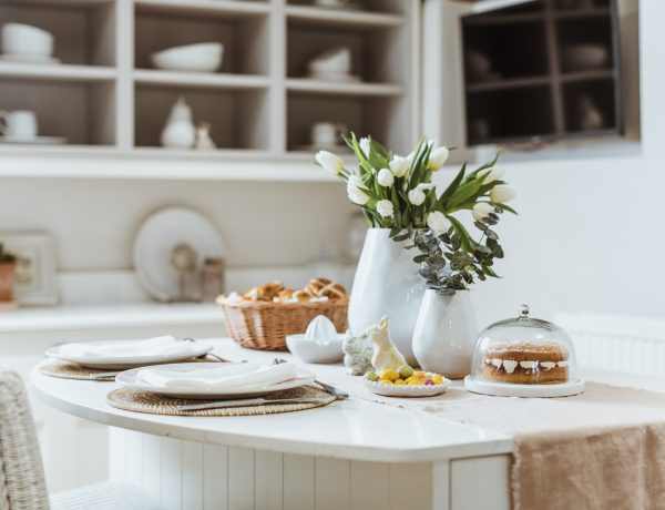
Picking colour for your kitchen
Give your modern, traditional, or shaker kitchen cool class, with shades of black styled to offer a sense of sophistication and glamour, while contrasting whites can be used to enhance feelings of simplicity, stability, and clarity, perfect for family time. When colouring your kitchen, monochromatic blacks and whites can be combined effectively to offer complementary contrast, and a dynamic cooking and socialising environment.
Additionally, the kitchen is all about experiencing an eruption of senses, whether it be the gorgeous smell of bubbling food or spectacular taste of your marvellous creations. With this in mind, consider injecting subtle elements of yellow, with the bright colour associated with feelings of comfort, food, and fun.

Colour your room around your mood
When styling your space, it’s crucial to consider the entire emotional spectrum, and how different colours can influence certain moods. For instance, do you want your room to offer feelings of positivity, serenity, romance, or concentration, and how can varying colours help you deliver this?
- Calm serenity
For total tranquillity, choose shades next to each other on the colour wheel. These are called harmonious colours, and for good reason; restfulness and comfort immediately come to mind when you immerse yourself in a room that offers colourful fluidity. Specifically, blues and greens are great for bringing calmness, balance, and equilibrium to your space, while a threatening red is perhaps one to avoid.
- Positivity
Manifest a positive mindset with bold and bright yellows and oranges. The former is considered the colour of confidence and self-esteem, while the latter is associated with fun and frivolity. Equally effective, reddish hues can also be used to give you feelings of power and excitement.
However, be careful to use each of the three sparingly; too much yellow can make a space overly emotionally charged, and evoke feelings of fragility, overdosing on sharp orange induces a sense of struggle and deprivation, while failing to temper reds can emit aggressiveness.
- Love and romance
For a romantic retreat within your own home, consider utilising rich red, with the powerful colour proven to stimulate pulsating passion and feelings of courage. Similarly, make use of pink tints dotted throughout, to bring about feelings of warmth, love, and femininity. However, pink is, perhaps surprisingly, particularly potent, so make sure to use shades in moderation, or else you could create an oppressive, emasculating environment.
- Concentration
In an era where remote working has become the norm, it’s increasingly important to have a space that complements your working life. To help build feelings of focus and concentration, combine soft blues, aimed at calming the mind, violets, proven to heighten awareness, and earthy browns, styled towards seriousness and supportiveness.
Understanding the impact of different hues
Truly understanding colour means having an awareness of the power of subtlety, and how combining only-slightly different shades can massively change or enhance the mood of a space.
In other words, a colour is broken down into different tones, but warm and sharp hues stimulate vastly different feelings. It’s important to take this into account when styling your kitchen, living room, bathroom, or bedroom.
For example, comparing blues, picking the wrong shade can lead you to creating an uninviting environment, when, in fact, you likely intended to design a space built around comfort. Similarly, red is among the most attention-grabbing colours, so picking the perfect hue is crucial, or else you run the risk of teetering into the realms of the threatening.

Style your colours around the kids
If you’ve children running about the house, consider the colours you use, and the psychological impact they might be having on their malleable minds. Encourage feelings of playfulness, innocence, and harmless fun, with colours such as yellow, orange, and pink.
As highlighted previously, yellow hues bring out confidence, which is a crucially important trait in young children, orange shades enhance feelings of care-free fun, while maintaining the illusion of security, while pinks in moderation can be used to offer a sense of warmth and soothing safety.
In contrast, try to avoid heavy use of red in child-friendly spaces; the colour is proven to negatively impact academic concentration, such as revising and studying for school.

What colours are best for pets?
Pets are in a unique position in that they tend to see colour through a slightly different lens to human owners. Dogs, for instance, have limited capacity to analyse colour, and certain tones, such as bright reds and yellows, can be over-stimulating. With this in mind, your palette should sway towards shades that facilitate a soothing, relaxing environment, such as soft greys, blues and violets.

Picking suitable shades for socialising
Socialising is about having fun with friends and family, so your colour scheme should lean towards those that stimulate high energy and excitement. In this case, vibrant reds can be styled to raise pulses, subtle doses of fiery orange can evoke harmless immaturity (we can’t be serious all the time!), and vivid yellows are guaranteed to lift spirits – perfect for a fun environment styled around food, drink, and good company.
What to avoid when contemplating colours
The main thing to avoid when decorating your home is over-using colour. This applies to dark, light, and pastel tones, as well as walls, furniture, and features. It is possible to have too much of a good thing, so don’t get blindsided by a colour you love.
Similarly, don’t fall into the trap of combining too many colours in one space. This can be overwhelming and overstimulating. Blending too many moods can also negate the positive impact of colour; determine how you want a room to make you feel, and stick to shades that elevate and enhance these emotions.
The psychology of colour is incredible, and the impact varying shades can have on mood is intriguing. Explore even more expert advice and kitchen styling tips by visiting our blog.


No Comments